Benner Cycle Explained (For Crypto & TradFi)
Discover how the Benner Cycle predicts market peaks and crashes, with practical insights for trading traditional and crypto markets using this historic model.

Fact checked
Key Takeaways:
- What it is: The Benner Cycle is a century-old forecast model that charts future market booms and busts using fixed intervals based on historical price behavior and crowd emotion.
- What the key components are: It organizes time into a sequence of panic years, good times, and hard times, each following a distinct pattern that traders can use to anticipate broad shifts.
- How it ties to crypto: Although built on older markets, the cycle’s emotional logic aligns with crypto's extreme swings, making it a useful lens when paired with halving data and onchain trends.
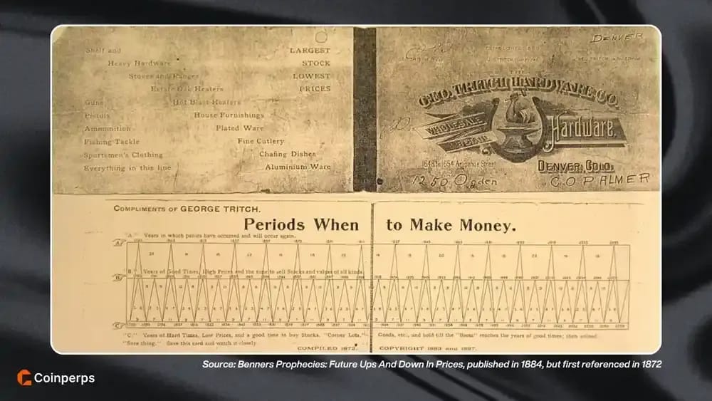
You’ve probably seen the Benner Cycle chart floating around on X with mysterious dates, spiky peaks, and bizarre market calls. It looks like a riddle, but behind it is a real framework built 150 years ago.
We tracked down the original 1884 edition of Benner’s book (all 182 pages of it) and pulled out the insights nobody’s explaining. This guide breaks it all down, with context, examples, and practical ways to use it now.
What is the Benner Cycle?
The Benner Cycle is a long-range market forecasting model that plots out economic booms and busts from the year 1763 all the way to 2059. It uses recurring time intervals to segment financial history into phases of optimism, fear, and recovery, helping traders anticipate major turning points decades in advance.
The framework was created by Samuel Benner, a struggling Ohio farmer who lost everything in the 1873 financial panic. Looking to decode the patterns behind his ruin, he turned to historical price data and later published a book called "Benner’s Prophecies of Future Ups and Downs in Prices" that laid out his theory of repeating cycles.
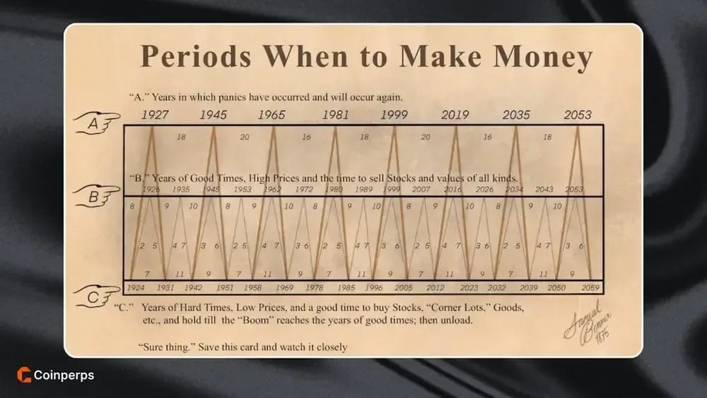
His chart divides market conditions into three core phases: Panic Years, Good Times, and Hard Times, each following a predictable numerical rhythm. These cycles repeat over decades and have often lined up with real-world market crashes, recoveries, and peaks with surprising precision.
How to Read the Benner Cycle Chart
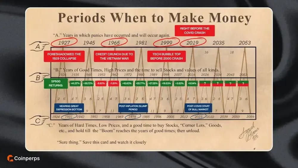
The Benner Cycle chart visually maps market highs and lows across more than 150 years of financial history. It has shown striking alignment with catastrophic events like the Great Depression (1929), the Dot-Com bubble (2000), and the COVID-19 crash (2020), suggesting that long-term market swings may repeat.
To fully understand how the chart works, let’s break down its core structure and numeric logic in two parts:
1. Core Structure: Panic Years, Good Times, and Hard Times
Benner’s chart is built around three repeating phases labeled as Line A, Line B, and Line C. Each line reflects a recurring emotional state of the market and follows a fixed mathematical sequence.
- Line A (Panic Years): These are major crash periods occurring on a repeating 54-year loop, using a pattern of 18, 20, and 16 years. Examples include 1927 (which foreshadowed the 1929 collapse), 1945 (end of WWII and market volatility), 1981 (inflation peak), 1999 (tech bubble top), and 2019 (right before the COVID crash in early 2020). The next panics are forecast for 2035 and 2053.
- Line B (Good Times): These mark the high-price periods in the cycle, and are spaced out using an 8-9-10-year rhythm. These are the years where, historically, it made sense to take profits, including 1926, 1962, 1980, 2007, and the upcoming 2026. They often arrive just before Line A panics.
- Line C (Hard Times): These identify low points in the market and are structured using a 7-11-9-year structure. These troughs offer prime conditions for long-term accumulation and have included years like 1931 (Great Depression bottom), 1978 (post-inflation slump), and 2023 (post-COVID crash).
Each of these cycles overlaps and interacts, giving the chart its distinctive zig-zag pattern. Investors are meant to buy during "Hard Times," hold through recovery, and sell during "Good Times", while remaining cautious near "Panic" years.
2. Interpreting the Chart’s Inner Numbers and Triangle Grid
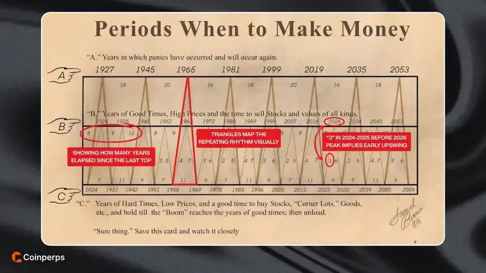
Beyond the three primary lines, Benner’s chart contains an embedded numerical system that overlays a triangular pattern. These inner numbers, such as "2," "5," or "7", appear between the vertical year markers and indicate the number of years between inflection points across the three lines.
Here’s how to break it down:
- The small numbers represent intervals between events on each line. For example, between two "Good Times" peaks, you might see 8, 9, or 10, showing how many years elapsed since the last top.
- The triangles map the repeating rhythm visually. Each triangle has numbers along its sides; these reflect the cycle formula Benner used: 7-11-9 for Hard Times, 8-9-10 for Good Times, and 18-20-16 for Panics. They help you understand how the chart "builds" into a new peak or bottom.
- They provide a visual countdown mechanism. If the chart shows a 2 or 3 between a trough and an upcoming peak, it implies you’re in the early phase of an upswing. Conversely, seeing a 9 or 10 before a marked Panic year signals the top is near.
- No color coding means you must read relationally. The chart isn’t labeled with trend direction arrows, so you must trace between the numbers and year markers using pattern awareness, or how far along are we in the current triangle cycle in other words.
- It’s a compound timer. Each number connects the dots within and across cycles, showing how Line A (Panics), Line B (Highs), and Line C (Lows) interlace over time.
Applying the Benner Cycle to Cryptocurrency Markets
The cryptocurrency market is only a little over a decade old, which is a blink of an eye compared to the centuries of data behind traditional market cycles. However, crypto markets are notorious for pump-meltdown cycles induced by human emotion, a huge rallies of euphoria followed by crushing panic sell-offs.
This trait makes many crypto traders keenly aware of cycles, even if they’re much shorter, often tied to Bitcoin’s roughly 4-year halving. So, it’s natural to ask whether something like the Benner Cycle’s long-term framework can offer insight into crypto trading today.
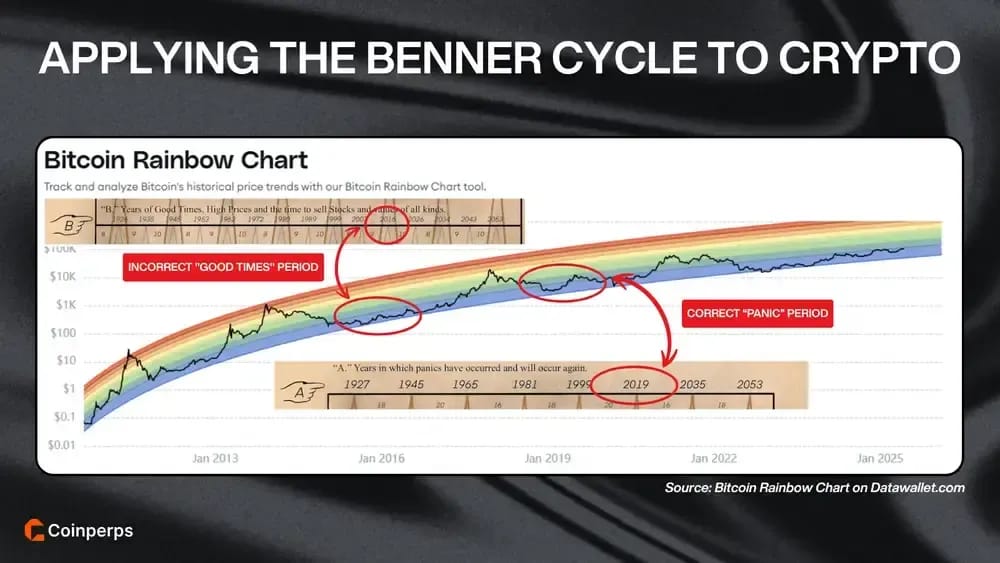
Despite limited history, mapping Benner’s card onto crypto shows interesting alignments. The cycle called for a panic around 2019, and indeed Bitcoin experienced a brutal bear market from late 2018 into early 2019, with a notable correction mid-2019 as seen on the Bitcoin Rainbow Chart.
Benner’s forecast of "hard times" in 2020-2021 also lined up, as the March 2020 stock market crash marked a major bottom for crypto. Looking ahead, Benner’s chart marks 2026 as a "Good Times" peak year, which may align with the next Bitcoin cycle top expected after the 2024 halving.
Practical Trading Tips for Using the Benner Cycle
The Benner Cycle offers an ucommon lens into market timing, but using it well requires interpretation, patience, and tactical execution. These tips help traders align with the cycle without relying on it blindly.
How to trade the Benner Cycle most safely:
- Use forecast years as broad windows, not deadlines: Treat Benner’s dates as general zones where conditions may shift, not as precise moments to enter or exit.
- Start preparing in advance of cycle signals: Begin tracking market sentiment and technical setups at least 6 to 12 months before a projected peak or trough.
- Wait for confirmation before acting on forecasts: Only take action when price structure, macro indicators, and sentiment clearly align with the cycle window.
- Let the cycle inform bias, not trigger trades: Use the forecast to guide your bullish or bearish stance, but require evidence to place actual trades.
- Build positions gradually near turning points: Scale in or out over time to manage uncertainty and reduce the impact of being early or late.
- Always define risk and protection upfront: Know your exit strategy before entering a trade, and use stop-losses or hedging to guard against incorrect cycle calls.
- Layer in shorter-term signals for precision: Combine the long-term Benner view with trendlines, support-resistance breaks, or advanced indicators like VWAP for better entry timing.
- Treat the cycle as one tool among many: Balance Benner’s historical roadmap with current fundamentals, market context, and technical analysis to avoid tunnel vision.
Benner Cycle for Crypto vs Traditional Markets
The Benner Cycle was built on the deep historical record of traditional markets, which include over a century of data across stocks and commodities. Crypto, by contrast, has less than two decades of history, making any long-term cycle analysis far more speculative and less statistically grounded.
Traditional markets move in long arcs (booms and busts that often unfold over many years) while crypto cycles are faster, more compressed, and more volatile. As a result, crypto may experience several full bull-bear cycles within a single Benner phase, making the alignment more interpretive than precise.
In traditional markets, Benner can act as a loose macro compass with some historical reliability. In crypto, it functions more as a curiosity or philosophical overlay that's worth observing, but never worth trusting on its own without confirmation from crypto-native cycles and signals.
Still, it’s remarkable that a model built from 1800s hog, corn, and iron prices continues to surface in charts tracking decentralized assets born after Satoshi’s 2008 whitepaper. They are over a century apart in data and design, yet both echo the same recurring rhythm of fear, greed, and reversal.
Bottom Line
So... was Samuel Benner a time traveler? Probably not. He was just a broke Ohio farmer who lost everything and started looking at price charts to find a pattern that made sense.
In that way, he was like most of us: not a trained economist but someone staring at the madness of the market, trying to turn pain into a plan. The crazy part is, his hand-drawn forecast from 1875 has held up better than most modern models.
Maybe the real edge isn't complexity, but rather paying attention long enough to notice the rhythm everyone else ignores and using that to beat the market.
Frequently asked questions