









What Is the Ethereum Liquidation Heatmap?
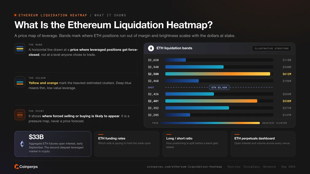
The Ethereum liquidation heatmap estimates where leveraged ETH perpetual positions would be forcibly closed. Each horizontal band represents a price at which a group of positions may run out of margin. Brighter bands indicate a higher estimated dollar value of potential liquidations.
Ether is the second-deepest leveraged market in crypto. Aggregate ETH futures open interest was near $33 billion in early September. At that scale, liquidations can reinforce the move that triggered them. When a long cluster is hit, forced selling may push the price towards the next cluster below.
On Coinperps, the ETH heatmap appears alongside funding rates, the long/short ratio, and the live ETH perpetuals dashboard. Together, these tools show how much leverage is in the market, which side is paying to maintain it, and where that positioning may break.
How to Read the Ethereum Liquidation Heatmap
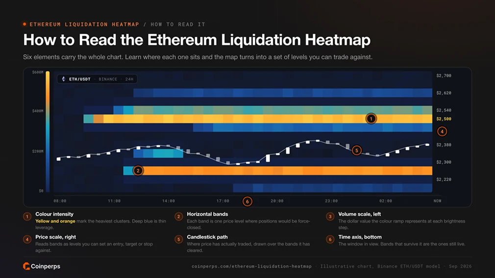
Each part of the chart reveals a different aspect of ETH leverage exposure.
- Colour intensity: Brighter bands contain more estimated leveraged exposure at that price. On the default palette, yellow and orange represent the largest clusters, while deep blue indicates thinner exposure.
- Horizontal bands: Each band corresponds to a single ETH/USDT price. A band that remains bright across the full window suggests positions from different entry times and leverage tiers share a similar liquidation price.
- Volume scale (left): Shows the estimated USD exposure within each band, allowing clusters to be measured in dollars rather than by colour alone.
- Price scale (right): Links each band to a live ETH price that traders can use when setting alerts or scaling orders.
- Candlestick path (centre): Tracks the live ETH price through the liquidation bands. A wick that enters a bright band and then reverses may show that the cluster has been cleared.
- Time axis (bottom): Indicates how long each cluster has persisted. A level visible across the 7-day and 30-day views generally carries more weight than one that appeared an hour ago.
How Ethereum Liquidation Levels Are Modelled
Exchanges do not publish every trader's liquidation price, so heatmaps rely on estimates. The model uses ETH open interest and recent trading volume, then assumes positions were opened across common leverage tiers. It projects a liquidation price for each modelled position before grouping the results into price bands weighted by position size.
On Binance Futures, liquidation occurs when a position's margin balance falls below the maintenance margin. The mark price, rather than the last traded price, triggers the process under Binance's liquidation protocols. Maintenance margin rates also increase with position size under the tiered leverage and margin table. As a result, large ETH positions may liquidate after a smaller adverse move than the headline leverage suggests.
These figures exclude maintenance margin and clearance fees, both of which move the actual liquidation price closer to entry. The Coinperps Ethereum heatmap models the ETH/USDT perpetual on Binance, the deepest single venue for ether leverage. Realised liquidations from Bybit, OKX, Bitget, and Hyperliquid are available through the all-asset liquidations feed.
What Ethereum's Recent Liquidation Cycle Reveals
Ether completed a full leverage cycle in under a year. Each phase produced a distinct heatmap structure.
- The record cascade (October 10, 2025): More than $19 billion in leveraged crypto positions were liquidated in about a day following a tariff shock. ETH fell around 12% to roughly $3,436. FTI Consulting's post mortem notes that funding had approached 30% annualised during the preceding ether rally. It also found that unified cross-asset margin linked portfolios to their weakest holdings.
- The slow long unwind (early February): Leverage came out of the market in waves rather than through a single sell-off. On 1 February, one $222.65 million ETH long was liquidated on Hyperliquid as ether fell as much as 17%. Hyperliquid absorbed $1.09 billion of the $2.58 billion liquidated across venues that day. CryptoQuant data later showed the seven-day average of Binance ETH long liquidations at its highest level in four years as the price dropped from $3,000 towards $2,000.
- The short squeeze (19 August 2026): A US Treasury buyback announcement caught a market that had been short for weeks. Shorts accounted for roughly 92% of nearly $3 billion in liquidations, marking the largest short wipeout in records going back to 2021. Ether outpaced every other major asset, rising about 18% in one day as more than $1 billion of ETH shorts were cleared.
Positioning has since moved in the opposite direction. ETH open interest recovered to around $32.7 billion during the first days of September. Funding remained positive at more than twice Bitcoin's rate, while most Binance ETH accounts were net long around the $2,500 area.
On the heatmap, this appears as larger long clusters below the current price. That structure is associated with potential long liquidations rather than a short squeeze.

How Traders Use the Ethereum Liquidation Heatmap
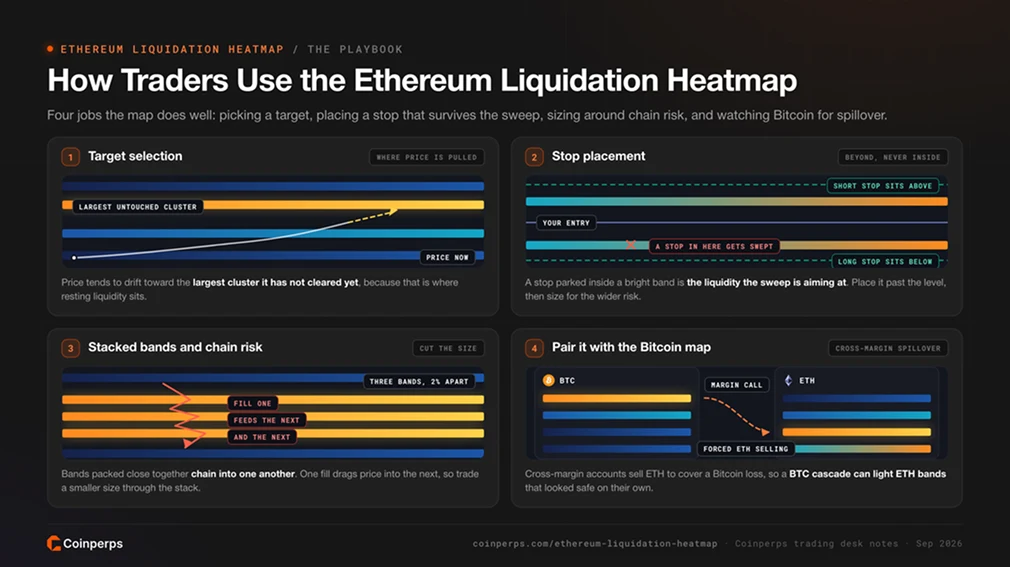
Target selection is the most common use. Price often gravitates towards the largest untouched cluster, particularly when funding is heavily tilted to one side. Traders identify the nearest major band above and below the current price, then treat each as a possible destination rather than a barrier. A reversal may begin after the band is cleared and forced orders are exhausted.
Stops placed within a bright band sit directly inside a visible liquidation cluster. Moving the stop beyond that area, or reducing position size to accommodate a wider stop, can keep the trade away from the cascade. Our guide to avoiding auto-deleveraging explains what happens when the insurance fund is overwhelmed.
Several bright bands packed into a narrow range create additional risk. One liquidation may lead into the next, moving ETH several percent within minutes. Traders may reduce their size or avoid entries near these stacked zones. They also monitor whether open interest continues to build into the band or begins draining away.
Ether rarely liquidates in isolation. When Bitcoin falls, cross-margin accounts can lose collateral across the portfolio. The Bitcoin liquidation heatmap therefore provides useful context, especially for traders using cross-margin venues. The Fear and Greed Index can help assess whether a sweep is more likely to reverse or extend.
Ethereum vs Bitcoin Liquidation Heatmaps
Both heatmaps use the same underlying method, but their clusters behave differently. This affects how far bands sit from the market price and how long they remain intact.
ETH clusters tend to resolve faster. A band that remains untouched for days on the Bitcoin chart may be cleared within a single ether session, so ETH traders often focus on the 12-hour and 24-hour windows. Spot demand can be monitored through the Ethereum ETF tracker and the Ethereum treasury companies page.
Limitations of the Ethereum Liquidation Heatmap
Several limitations affect how much weight traders should give each band.
- Estimated positions: Cluster locations are inferred from open interest and volume. Providers using different leverage assumptions may place the same cluster hundreds of dollars apart, with similarly wide differences in estimated size.
- Single-venue coverage: The chart models Binance ETH/USDT. Hyperliquid accounted for more than 40% of realised liquidations on 1 February. Clusters concentrated there, or within coin-margined ETH contracts, are not shown.
- Spot demand is invisible: ETF creations, treasury company purchases, and staking deposits can move ether without entering the perpetual market. This demand may absorb selling that the heatmap suggested would cascade.
- Refresh lag during cascades: In a fast sell-off, clusters that were relevant five minutes earlier may already have been cleared. Surviving positions can then diverge from the model for hours.
- Mark price versus last price: Exchanges use the mark price for liquidation, while the candlestick path displays the traded price. A brief gap between the two can make a sweep appear early or late.
What does a bright band on the Ethereum liquidation heatmap mean?
A bright band represents a price where estimated leveraged ETH exposure is concentrated. If ether reaches that level, the exchange's liquidation engine may force-close positions and create a burst of buying or selling. That activity can carry the price towards the next band.
How accurate is the Ethereum liquidation heatmap?
Cluster locations tend to be directionally reliable because they are derived from open interest and realised liquidation history. Estimated sizes depend on the model and vary between providers. Bands should be treated as zones of elevated risk, not exact liquidation prices.
Which timeframe suits short-term ETH trading?
Intraday traders typically use the 12-hour and 24-hour views to identify stop-hunt targets and near-term price magnets. Swing traders rely on the 7-day and 30-day views to find clusters that have remained in place across several sessions.
Does the heatmap cover every exchange?
The Coinperps Ethereum heatmap models the ETH/USDT perpetual on Binance. For broader market context, use it alongside the all-asset liquidations feed and the ETH perpetuals page.
Why do ETH clusters get swept more often than BTC clusters?
Ether has higher realised volatility and its funding tends to run hotter. Leveraged positions therefore sit closer to their liquidation prices, while crowded positioning builds more quickly. Cross-margin contagion from Bitcoin creates another potential trigger outside the ether market.
Are liquidation heatmaps available for other assets?
Yes. Coinperps publishes live heatmaps for the Bitcoin, Solana, XRP, BNB, and HYPE perpetual markets.