










What the Bitcoin Liquidation Heatmap Shows
Every leveraged Bitcoin position has a price at which the exchange will close it. The heatmap combines those liquidation prices into one view. Areas with heavy exposure appear as bright bands, while lightly exposed levels remain dark. This shows where forced buying or selling may enter the market if Bitcoin reaches a given price.
Bitcoin is the reference market for the broader asset class. Futures open interest across venues exceeds $50 billion, more than for any other crypto asset. BTC also serves as collateral for a large share of cross-margin accounts. When Bitcoin liquidation clusters break, the losses often spread into Ethereum, Solana and smaller assets.
This makes the BTC heatmap the first chart to check. A Bitcoin liquidation wave often reaches the Ethereum and Solana heatmaps a few minutes later.

Reading the Chart Layer by Layer
Read the chart in a consistent order to reduce it to a few actionable levels.
- Find the current price first: The candlestick path through the centre shows live BTC/USDT pricing. Short liquidation risk sits above it, while long liquidation risk appears below.
- Scan for the brightest band on each side: Yellow and orange bands represent the most estimated exposure. The closest bright band above and below the market marks the two levels most likely to be tested next.
- Check the volume scale on the left: This converts colour intensity into dollars. A $40 million band carries far less weight than one worth $400 million.
- Read the price scale on the right: Each band aligns with a specific Bitcoin price. These are useful alert levels, but traders should avoid placing stops inside them.
- Judge persistence on the time axis: A band that remains visible throughout the 7-day or 30-day window has survived several sessions of repositioning. One formed an hour ago may disappear just as quickly.
- Reconcile with the wider dashboard: Compare the heatmap with open interest, funding rates and the long/short ratio. These indicators help confirm which side is crowded before a band is treated as a target.

Why Collateral Type Changes the Bitcoin Liquidation Map
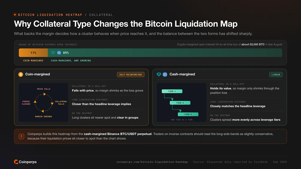
A meaningful portion of Bitcoin leverage has historically been margined in BTC rather than stablecoins, which is unusual among crypto assets. The collateral type affects how a cluster behaves when price reaches it. The balance between these two forms of margin has also shifted sharply.
Glassnode data reported by CoinDesk shows that crypto-margined Bitcoin open interest fell to an all-time low of roughly 52,000 BTC in late August, equal to about 11% of the total. Cash-backed collateral now dominates. This weakens the feedback loop that made earlier Bitcoin liquidation cascades so severe.
Coinperps builds its Bitcoin heatmap from the Binance BTC/USDT perpetual, which is a cash-margined contract. Traders using inverse contracts should treat the long-side bands as slightly conservative because their liquidation prices sit closer to the current market than the chart suggests. Our guide to inverse perpetual contracts explains the maths.
Bitcoin's Leverage Reset So Far This Year
Bitcoin's derivatives market has moved through a full drawdown and recovery. Each phase reshaped the heatmap.
- First-half deleveraging: BTC declined by roughly 40% between January and late June. Futures open interest unwound gradually through liquidations and voluntary closures rather than a single flush. Long bands were consumed in stages as the price moved towards $60,000.
- The mid-August drop: Total crypto futures open interest fell by about $3 billion within minutes during a sharp sell-off, alongside $308 million in liquidations. Bitcoin represented roughly $24 billion of the exposure at the time, making it the market's largest source of leverage.
- The short squeeze: Bitcoin rose from about $62,000 to $80,000 between 19 and 24 August, recording its second-best week since early 2021. Open interest measured in BTC dropped to a five-month low of around 587,000 contracts during the rally. The move was therefore driven by shorts closing or being liquidated, not by new long positions.
- The 2 September long liquidation wave: Bitcoin failed to hold $80,000 on its second attempt and fell to about $76,500 as the odds of a Fed rate hike increased. Roughly $368 million was liquidated across the crypto market, with longs accounting for more than 80% of the losses.
- Reclaiming $80,000: Softer labour data and a $731 million single-day inflow into spot Bitcoin ETFs helped BTC move back above $81,000 on 4 September. It was the largest daily ETF inflow since January, while short liquidations represented more than 90% of the day's total.

Where Bitcoin's Clusters Sit Now
The current map is unusually balanced. Long and short positioning on major exchanges is close to even, while annualised funding has remained below 10% throughout the rally. Open interest measured in BTC also sits well under its August peak. These conditions do not point to a crowded trade, and analysts have described the recovery as healthier than previous rallies.
The $80,000 area remains the key pivot. It capped the August squeeze, failed on 2 September and was reclaimed two days later. New long clusters have formed within the few thousand dollars below that level. A similar distance above the market, short bands remain from the failed retest. The side that clears first is likely to determine the month's direction.
The heatmap cannot account for spot demand. ETF share creations and corporate treasury purchases absorb Bitcoin without increasing leverage. Coinperps' Bitcoin ETF tracker and Bitcoin treasury holdings pages indicate whether that demand is present on a given day. A cluster that might trigger a cascade in a thin market can instead be absorbed when ETF demand reaches several hundred million dollars per session.

Onshore Bitcoin Perpetuals Are Changing the Picture
Bitcoin is the first crypto asset to have a true perpetual contract approved for a regulated US exchange. This changes where part of its leverage is held.
- CFTC approval: The Commodity Futures Trading Commission approved KalshiEX's BTCPERP contract on 29 May 2026. It was the first perpetual referencing spot Bitcoin to be listed as a futures contract on a designated contract market. Coinperps examines the product in its Kalshi perpetuals review.
- Coinbase and Bitnomial: The regulator separately issued a no-action letter, which is a formal commitment not to pursue enforcement action. It allows Coinbase to connect US customers with global perpetual offerings. Coinbase Derivatives already operates perpetual-style futures with round-the-clock trading, while Bitnomial received approval for long-dated contracts in December.
- CME's challenge: CME has sued over the Kalshi approval, arguing that a contract without a fixed expiry does not fit within the US futures regime. The CFTC asked the court to dismiss the case on 2 September. Its outcome will influence how widely perpetual-style contracts spread across regulated US markets.
Regulated venues apply leverage limits and volatility controls alongside identity checks. Positions are therefore smaller and sit further from the current price than the offshore clusters modelled by this heatmap. As US trading volume expands, more Bitcoin leverage will move to venues outside the chart's coverage. Our perpetual futures regulation explainer tracks the rules across jurisdictions.
Limitations of the Bitcoin Liquidation Heatmap
Frequently Asked Questions
What does a bright band on the Bitcoin liquidation heatmap mean?
A bright band marks a price where the exchange would close a large volume of leveraged Bitcoin positions if the market reached it. Bands above the current price represent shorts, whose forced closure creates buying. Those below represent longs and produce forced selling. Greater brightness indicates a larger potential burst.
How is the Bitcoin liquidation heatmap different from a liquidation map?
A liquidation map captures estimated positions at one point in time. The heatmap also shows how those positions change, making it possible to distinguish bands that have lasted for several days from those formed during the current session. Persistent bands are more likely to represent structural levels rather than noise.
Why is Bitcoin liquidating less violently than it used to?
Most Bitcoin leverage is now margined with stablecoins instead of BTC. During a sell-off, the collateral therefore does not lose value alongside the position. This removes the compounding mechanism behind earlier cascades. Lower realised volatility and strong ETF demand during price declines have further reduced their severity.
Does the heatmap include CME or US-regulated perpetuals?
No. The model covers the Binance BTC/USDT perpetual. CME futures, Kalshi's BTCPERP and Coinbase's perpetual-style contracts operate under different margin systems and are excluded. The Kalshi perpetuals review explains how those products handle liquidations.
How do traders use the Bitcoin heatmap to place orders?
The nearest bright band on either side can act as both a probable destination and a risk zone. Traders commonly place alerts at these levels and keep stops outside the clusters rather than within them. Entries can be scaled near a cluster's far edge, where forced orders may already be exhausted. The Fear and Greed Index can then help determine whether to trade against the move after the band clears or continue with it.
Are liquidation heatmaps available for other assets?
Yes. The same model is available for Ethereum, Solana, XRP, BNB and HYPE.